Distribution of maximum for 1-D prior example (RBF covariance)
Investigation into the distribution of the maximum for a 1-D toy example.
[2]:
from dolfin import *
import numpy as np
import numba
import ot
import matplotlib.pyplot as plt
import seaborn as sns
import pandas as pd
# import required functions from oneDim
from statFEM_analysis.oneDim import mean_assembler, kernMat, cov_assembler, sample_gp
from scipy.stats import linregress
from scipy import integrate
from scipy.linalg import sqrtm
from tqdm import tqdm
import sympy; sympy.init_printing()
# code for displaying matrices nicely
def display_matrix(m):
    display(sympy.Matrix(m))
Let’s first import the wass function created in the sub-module maxDist.
[3]:
from statFEM_analysis.maxDist import wass
Sampling from true maxiumum distribution in 1D
We will be interested in the toy example introduced in oneDim, however we will use different values for the parameters in the distribution of \(f\). To obtain a sample for the maximum from the true prior we must first sample trajectories from the true prior.
[4]:
# set up true mean
@numba.jit
def m_u(x):
    return 0.5*x*(1-x)
[5]:
# set up kernel functions for forcing f
l_f = 0.01
σ_f = 0.1

@numba.jit
def c_f(x,y):
    return (σ_f**2)*np.exp(-(x-y)**2/(2*(l_f**2)))

# translation invariant form of c_f
@numba.jit
def k_f(x):
    return (σ_f**2)*np.exp(-(x**2)/(2*(l_f**2)))
[6]:
# set up true cov function for solution
# compute inner integral over t
def η(w,y):
    I_1 = integrate.quad(lambda t: t*c_f(w,t),0.0,y)[0]
    I_2 = integrate.quad(lambda t: (1-t)*c_f(w,t),y,1.0)[0]
    return (1-y)*I_1 + y*I_2

# use this function eta and compute the outer integral over w
def c_u(x,y):
    I_1 = integrate.quad(lambda w: (1-w)*η(w,y),x,1.0)[0]
    I_2 = integrate.quad(lambda w: w*η(w,y),0.0,x)[0]
    return x*I_1 + (1-x)*I_2
[7]:
%%time
n_sim = 1000
grid = np.linspace(0,1,100)
np.random.seed(235)
u_sim = sample_gp(n_sim, m_u, c_u, grid, par = True, trans = False, tol = 1e-8)
CPU times: user 1.24 s, sys: 102 ms, total: 1.34 s
Wall time: 21.8 s
We now plot the sampled trajectories from the true prior.
[8]:
plt.rcParams['figure.figsize'] = (10,6)
plt.plot(grid,u_sim)
plt.xlabel('$x$')
plt.ylabel('$u$')
plt.title('Trajectories from the true prior')
plt.grid()
plt.show()
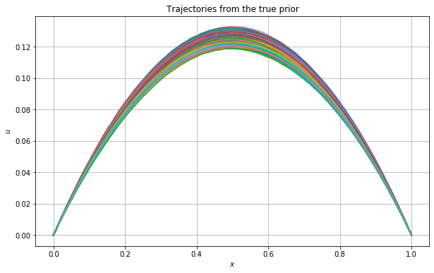
Note:
The maximum is not always located at \(x=0.5\). We will demonstrate this by plotting the \(\operatorname{argmax}\) for each simulated curve below.
[9]:
plt.plot(np.arange(1,n_sim + 1),grid[u_sim.argmax(axis=0)])
plt.hlines(0.5,1,n_sim,colors='red',linestyles='dashed')
plt.grid()
plt.xlabel('Sample number')
plt.ylabel('$\operatorname{argmax}$')
plt.title('Location of $\operatorname{argmax}$ for each simulated curve')
plt.show()
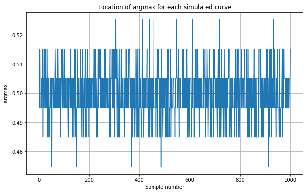
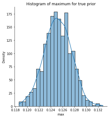
Let’s now get the maximum value for each simulated curve and store this in a variable max_true for future use. We plot the histogram for these maximum values.
[10]:
max_true = u_sim.max(axis=0)
[11]:
sns.displot(max_true,kde=True,stat="density")
plt.xlabel('$\max$')
plt.title('Histogram of maximum for true prior')
plt.show()
Sampling from statFEM prior maxiumum distribution in 1D
We now create a function to utilise FEniCS to draw trajectories from the statFEM prior.
[12]:
# create statFEM sampler function
def statFEM_sampler(n_sim, grid, h, f_bar, k_f, par = False, trans = True, tol=1e-9):
    # get length of grid
    d = len(grid)

    # get size of FE mesh
    J = int(np.round(1/h))

    # get statFEM mean function
    μ_func = mean_assembler(h, f_bar)

    # evaluate this on the grid
    μ = np.array([μ_func(x) for x in grid]).reshape(d,1)

    # get statFEM cov mat on grid
    Σ = cov_assembler(J, k_f, grid, parallel=par, translation_inv=trans)

    # construct the cholesky decomposition Σ = GG^T
    # we add a small diagonal perturbation to Σ to ensure it
    # strictly positive definite
    G = np.linalg.cholesky(Σ + tol * np.eye(d))

    # draw iid standard normal random vectors
    Z = np.random.normal(size=(d,n_sim))

    # construct samples from GP(m,k)
    Y = G@Z + np.tile(μ,n_sim)

    # return the sampled trajectories
    return Y
Let’s test this function out by using it to obtain samples from the statFEM prior for a particular value of \(h\).
[13]:
h = 0.1
f_bar = Constant(1.0)
np.random.seed(2123)
u_sim_statFEM = statFEM_sampler(n_sim, grid, h, f_bar, k_f)
Let’s plot the above trajectories.
[14]:
plt.rcParams['figure.figsize'] = (10,6)
plt.plot(grid,u_sim_statFEM)
plt.grid()
plt.xlabel('$x$')
plt.ylabel('$u$')
plt.title('Trajectories from statFEM prior with $h = $ %0.1f' % h)
plt.show()
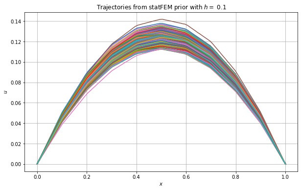
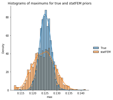
Let’s now get the maximum value for each simulated curve and store this in a variable max_statFEM for future use. We then plot the histograms for these maximum values together with those from the true prior.
[15]:
max_statFEM = u_sim_statFEM.max(axis=0)
[16]:
max_data = pd.DataFrame(data={'True': max_true, 'statFEM': max_statFEM})
sns.displot(max_data,kde=True,stat="density")
plt.xlabel('$\max$')
plt.title('Histograms of maximums for true and statFEM priors')
plt.show()
Our wass function requires the number of bins to be specified. Let’s investigate how varying this parameter affects the computed distance between the true maximums and our statFEM maximums.
[17]:
n_bins = np.arange(10,200,10)
wass_bin_dat = [wass(max_true,max_statFEM,n) for n in n_bins]
[18]:
plt.plot(n_bins,wass_bin_dat)
plt.grid()
plt.xlabel('number of bins')
plt.ylabel('2-Wasser distance')
plt.title('Plot showing how number of bins influences the computed distance')
plt.show()
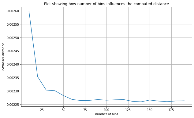
From the plot above we see that the distance flattens after around \(50\) bins. We choose to take n_bins=100 for the rest of this example.
We now set up a range of \(h\)-values to use for the statFEM prior.
[19]:
# set up range of h values to use
h_range_tmp = np.linspace(0.25,0.02,100)
h_range = 1/np.unique(np.round(1/h_range_tmp))
np.round(h_range,2)
[19]:
array([0.25, 0.2 , 0.17, 0.14, 0.12, 0.11, 0.1 , 0.09, 0.08, 0.08, 0.07,
       0.07, 0.06, 0.06, 0.06, 0.05, 0.05, 0.05, 0.05, 0.04, 0.04, 0.04,
       0.04, 0.03, 0.03, 0.03, 0.03, 0.02, 0.02, 0.02])
We now loop over these \(h\)-values, and for each value we simulate maximums from the statFEM prior and then compute the 2-Wasserstein distance between these maximums and those from the true prior.
[20]:
%%time
errors = []
###################
n_bins = 100
##################
np.random.seed(3252)
for h in tqdm(h_range):
    # sample trajectories from statFEM prior for current h value
    sim = statFEM_sampler(n_sim,grid,h,f_bar,k_f)
    # get max
    max_sim = sim.max(axis=0)
    # compute error
    error = wass(max_true,max_sim,n_bins)
    # append to errors
    errors.append(error)
100%|██████████| 30/30 [00:00<00:00, 38.58it/s]
CPU times: user 777 ms, sys: 6.76 ms, total: 784 ms
Wall time: 781 ms
Let’s now plot these errors against \(h\).
[21]:
errors = np.array(errors)
[22]:
plt.plot(h_range,errors)
plt.grid()
plt.xlabel('h')
plt.ylabel('error')
plt.title('Plot of errors vs h for max')
plt.show()
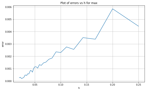
We see that as \(h\) decreases so too does the distance/error. Let’s investigate the rate by plotting this data in log-log space and then estimating the slope of the line of best fit.
[23]:
log_h_range = np.log(h_range)
log_errors = np.log(errors)

# perform linear regression to get line of best fit for the log scales:
lm = linregress(log_h_range,log_errors)
print("slope: %f    intercept: %f    r value: %f     p value: %f" % (lm.slope, lm.intercept, lm.rvalue, lm.pvalue))

# plot line of best fit with the data:
x = np.linspace(np.min(log_h_range),np.max(log_h_range),100)
plt.scatter(log_h_range,log_errors,label='data')
plt.plot(x,lm.intercept + lm.slope * x, 'r', label='fitted line')
# plt.plot(x,2+2*x,'--',c='black',label='reference line, $p=2$')
plt.plot(x,-1+1.35*x,'--',c='black',label='reference line, $p=1.35$')
plt.grid()
plt.legend()
plt.xlabel('$\log(h)$')
plt.ylabel('$\log(W)$')
plt.title('Plot of $\log(W)$ vs $\log(h)$ for maximum')
plt.show()
slope: 1.346020 intercept: -3.028927 r value: 0.971118 p value: 0.000000
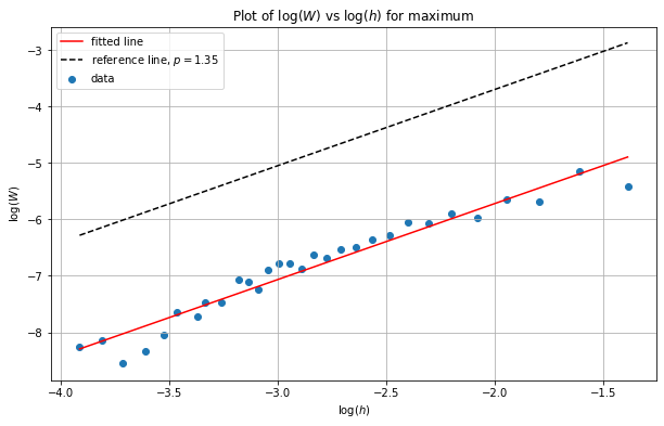
We can see from the above plot that the slope is around \(1.35\) - this differs from our theory showing the results for the \(\max\) are out of the remit of our theory.